User side
Core users wanted clearer collaboration, easier discovery, and more confidence when moving between teams and projects.
Clarifying how a collaborative whiteboard should feel once it grows beyond the canvas: who the product is for, how teams move through it, and how templates, projects, and permissions work together.
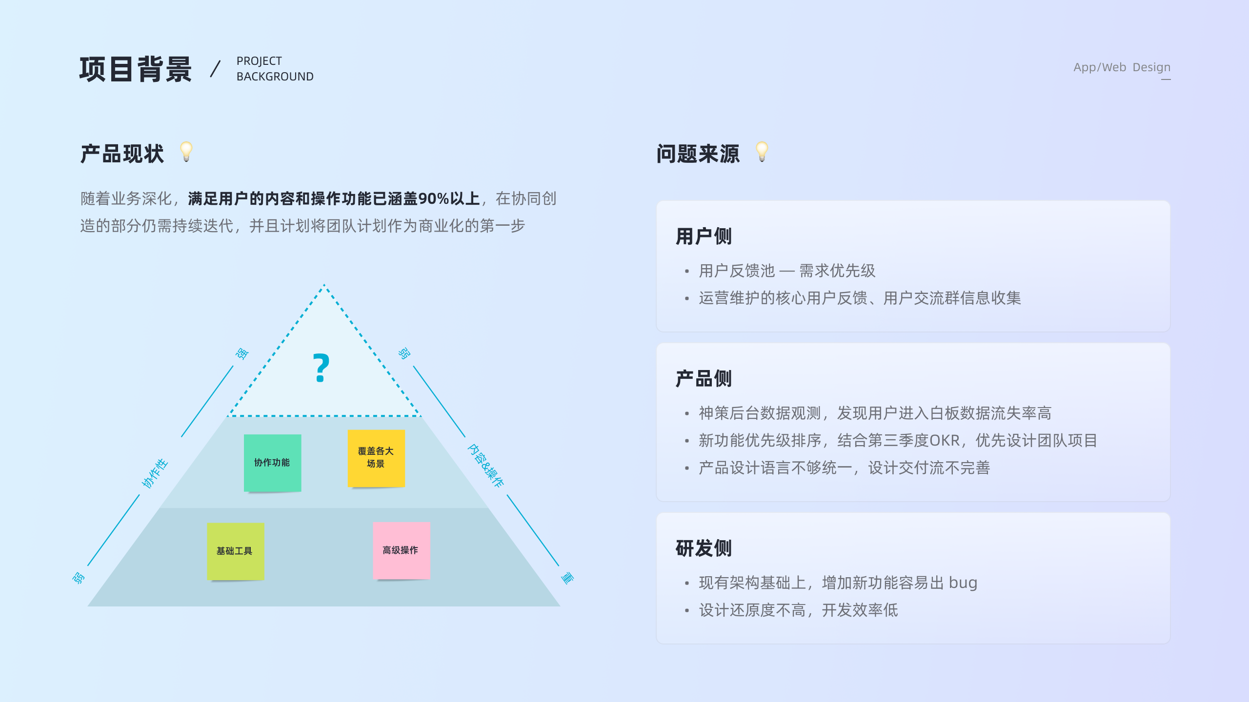
By the time I joined this project, Teamind had already covered most core whiteboard functions. The next question was not how to add more canvas tools, but how to make collaboration easier to understand and easier to scale.
The team was preparing collaboration and team features as part of the product's move toward commercialization. A standalone board model was no longer enough. The product needed clearer roles, clearer entry points, and clearer relationships between teams, projects, and boards.
The friction came from three directions at once. Users still had questions about team collaboration and how to find the right board. Product data showed heavy drop-off before users reached the whiteboard. Engineering also needed a structure that could support new features without making the product harder to maintain.
Core users wanted clearer collaboration, easier discovery, and more confidence when moving between teams and projects.
The product needed a team layer, stronger template entry points, and a more coherent structure for future business growth.
Inconsistent design language and weak handoff patterns were slowing implementation and making the product feel uneven.
I did not want to treat team features as a purely structural redesign. We compared Teamind against tools like Miro and Mural, reviewed how collaborative products exposed templates and team entry points, and paired that with direct user research.
The project used a broad questionnaire with 581 valid responses collected in five days, followed by 12 focused interviews. The research helped us understand how training teams, agile teams, and collaborative groups behaved differently, and where their expectations overlapped.

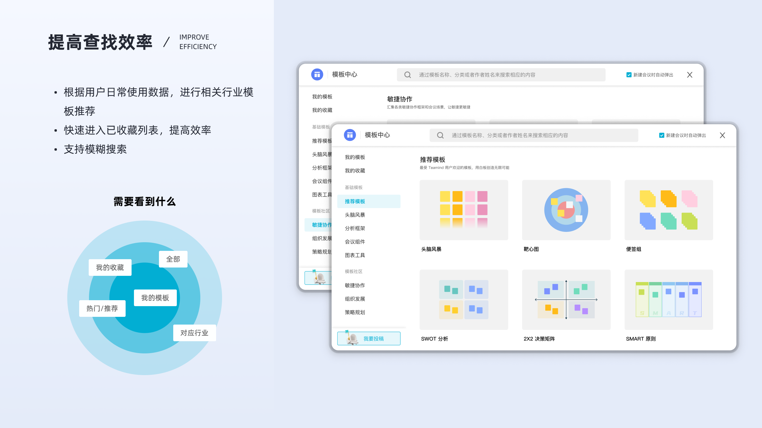
From the research, I organized the work around four directions: reduce learning cost, improve create-and-find efficiency, make permissions and states more legible, and treat the template center as part of the product instead of a side library.
Keep interaction patterns close to user habits, especially for laptop-heavy usage and presentation-oriented work.
Make board lists, search, recent items, and templates easier to discover from the workspace layer.
Show what changes across multiple teams, multiple projects, permissions, and invitation states without hidden rules.
Translate recurring product decisions into a clearer design language and early token structure.
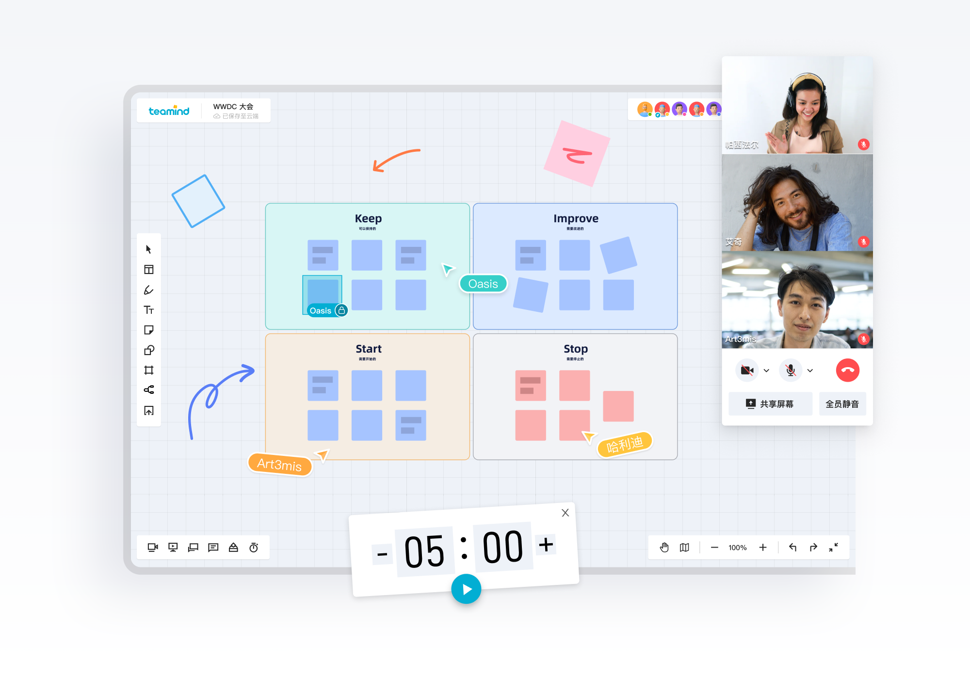
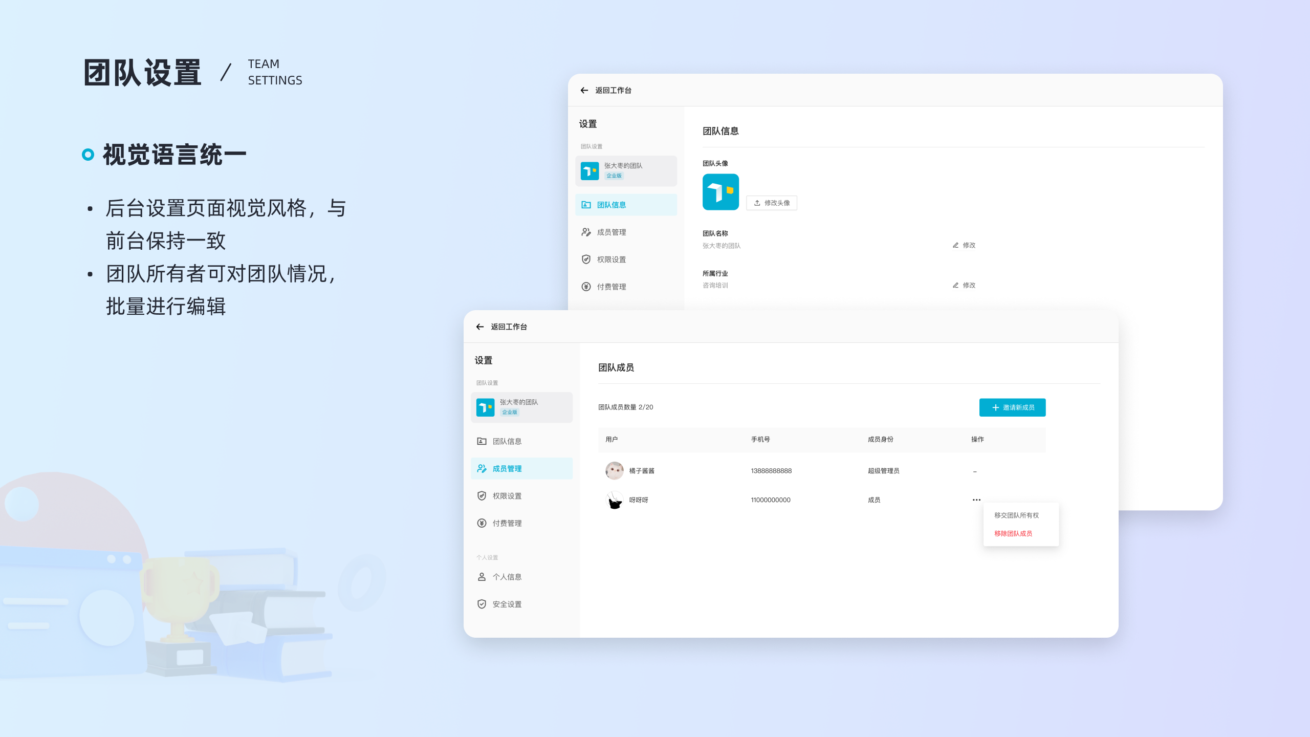
A major design move was to make the collaboration structure legible. We clarified how teams, projects, public boards, recent boards, and personal information should appear in the workspace, and what different roles could do inside each layer.
That work also needed to account for multi-team and multi-project scenarios. Instead of hiding that complexity, the interface showed it through explicit team switching, project grouping, member avatars, and clearer status feedback.
The template center became more than a storage surface. It supported the creation path by surfacing recommended templates, favorites, personal templates, industry-aligned suggestions, and search as connected entry points.
This was important because many creators did not want to start from a blank board every time. They wanted a fast jump into familiar structures that still felt light enough for real work.
Research showed that most target users worked on laptops, and many of them relied on software like PowerPoint in daily work. I used that insight to keep interactions closer to familiar desktop behavior where it helped, instead of forcing novelty for its own sake.
The onboarding layer mattered too. Guided teaching moments and motion-based cues helped new users understand tools, zoom, multi-select, and templates without having to guess from the toolbar alone.
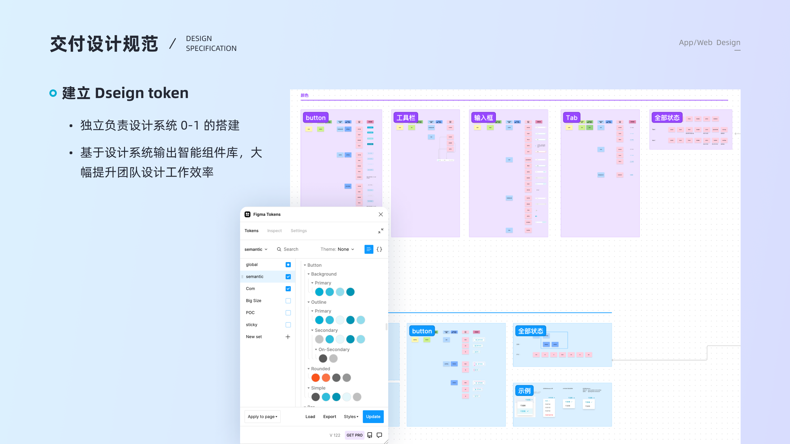
Part of the project extended into design system thinking. I participated in the early 0-to-1 token setup and semantic component structure, so repeated interface patterns could be shared across buttons, tabs, inputs, states, and tool surfaces.
That work made the product easier to maintain and easier to evolve. It also gave the collaboration layer a more coherent visual language instead of treating each new page as a separate one-off design.
valid questionnaire responses anchored the first round of collaboration decisions, followed by 12 interviews and continued product observation after launch.
The project shipped a clearer workspace structure, stronger template entry points, and team-facing collaboration capabilities that gave Teamind a more credible product foundation beyond the canvas itself.
It also shaped how I still work now: start with scenario, role, and state first, then decide the interface. That shift carries directly into my later workflow and AI projects.
This project matters because it was the first time I was clearly designing the model behind the screens, not just the screens themselves.