Enhancing Vendor Portfolio Publishing
Enhancing how wedding vendors organize, edit, and publish portfolio cases across web and mobile, so the platform could turn store content into real leads instead of abandoned drafts.
Context
In this product, vendors publish portfolio cases and packages to bring their store to life on the consumer side. Those cases are not decorative content. They are one of the main ways the platform helps vendors attract traffic, prove quality, and convert inquiries into real business.
The workflow touched three sides at once: vendors needed efficient tools, the platform needed better publishing quality, and operations teams needed a clearer way to guide store setup and respond to vendor feedback.
Opportunity
Data showed that the case publishing flow was leaking badly. Many vendors started the process, but only a small number made it all the way to a successful release. Filling the form took too long, managing categories was cumbersome, tables were hard to read on small laptops, and even small edits felt too expensive.
In the most severe funnel view, 4,286 vendors entered the flow and only 80 reached a successful release. That was enough to justify improving the workflow rather than applying a cosmetic refresh.
Research
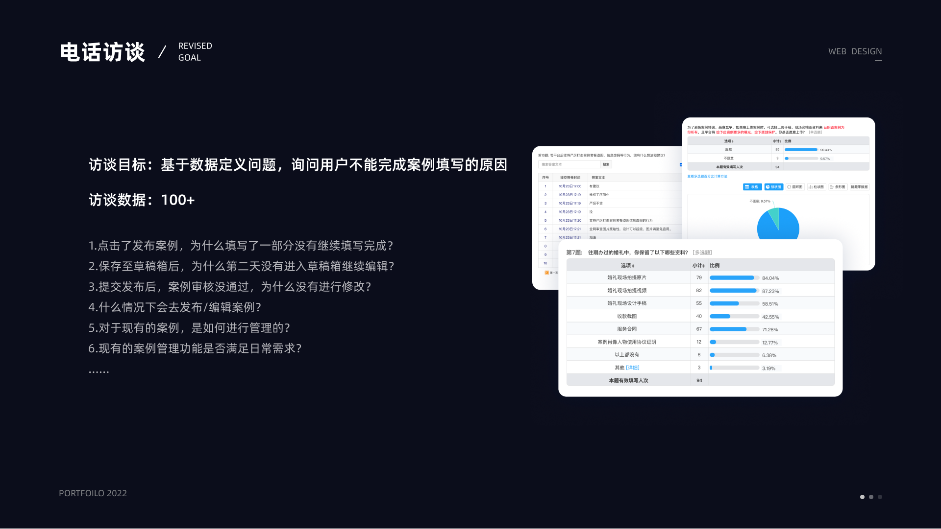
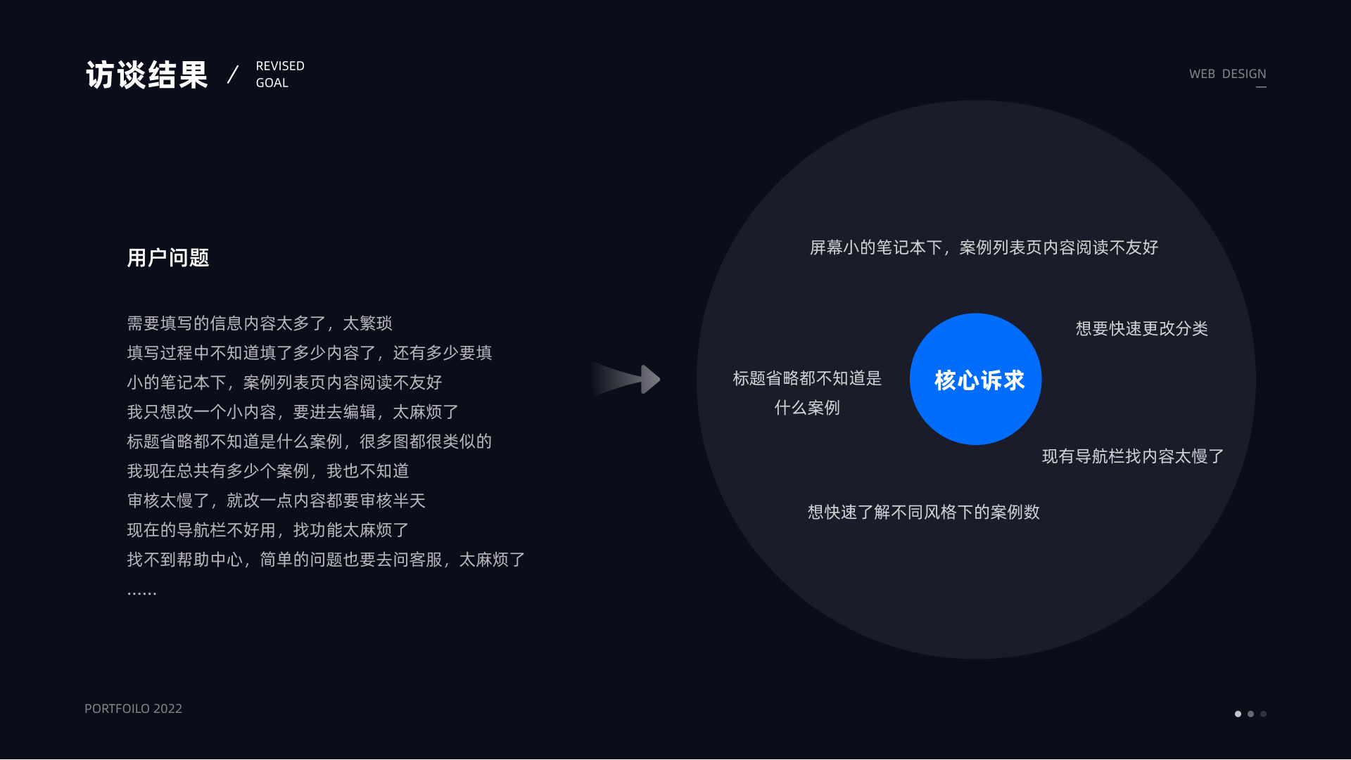
To understand why vendors stopped halfway, we combined funnel analysis with 100+ phone interviews. The interviews focused on partial completion, abandoned drafts, review rejection, day-to-day management habits, and whether the existing tools actually supported the vendors' real workflow.
The recurring issues were consistent: too much information, unclear progress, poor readability, slow review turnaround, and high friction for small category changes or quick edits.
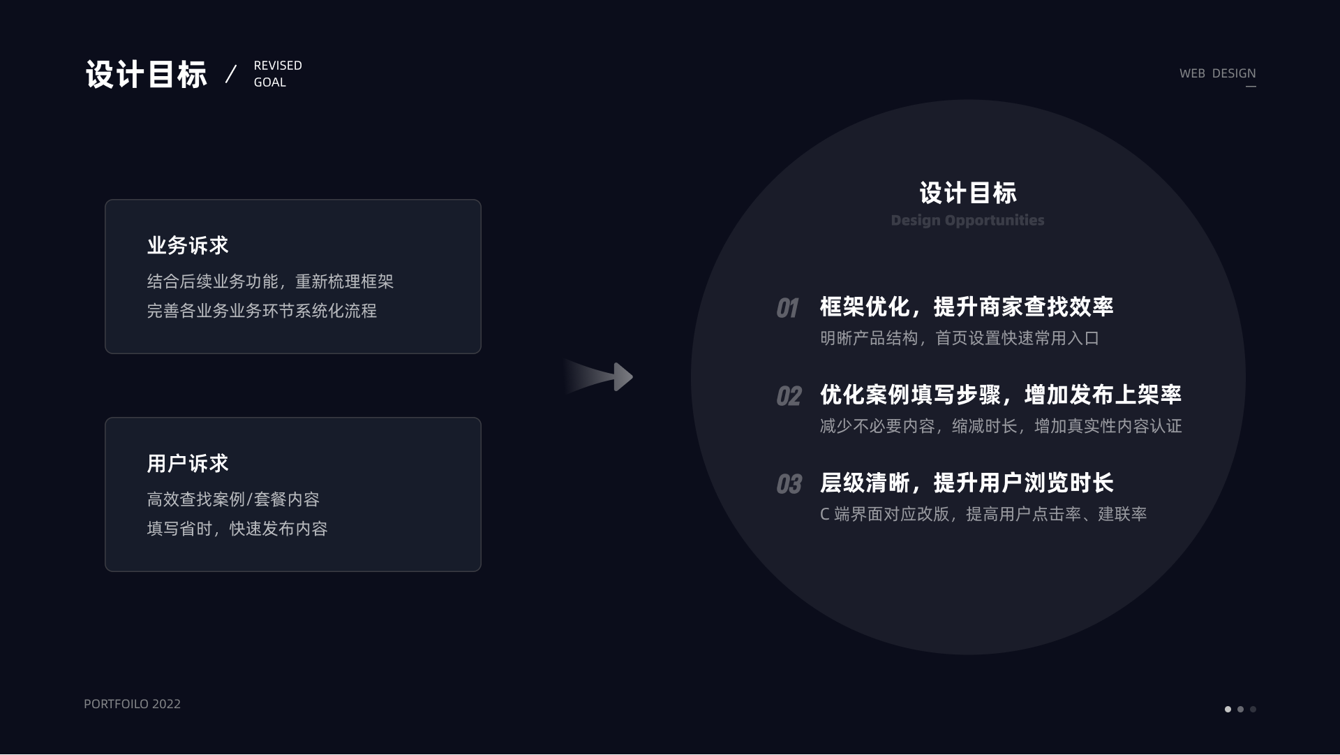
Response
I framed the work around three product moves. First, restructure the information architecture so vendors could find what they needed faster. Second, improve the case publishing flow so more vendors could finish and submit. Third, make the hierarchy clearer so the consumer-side channel could better support browsing and lead generation.
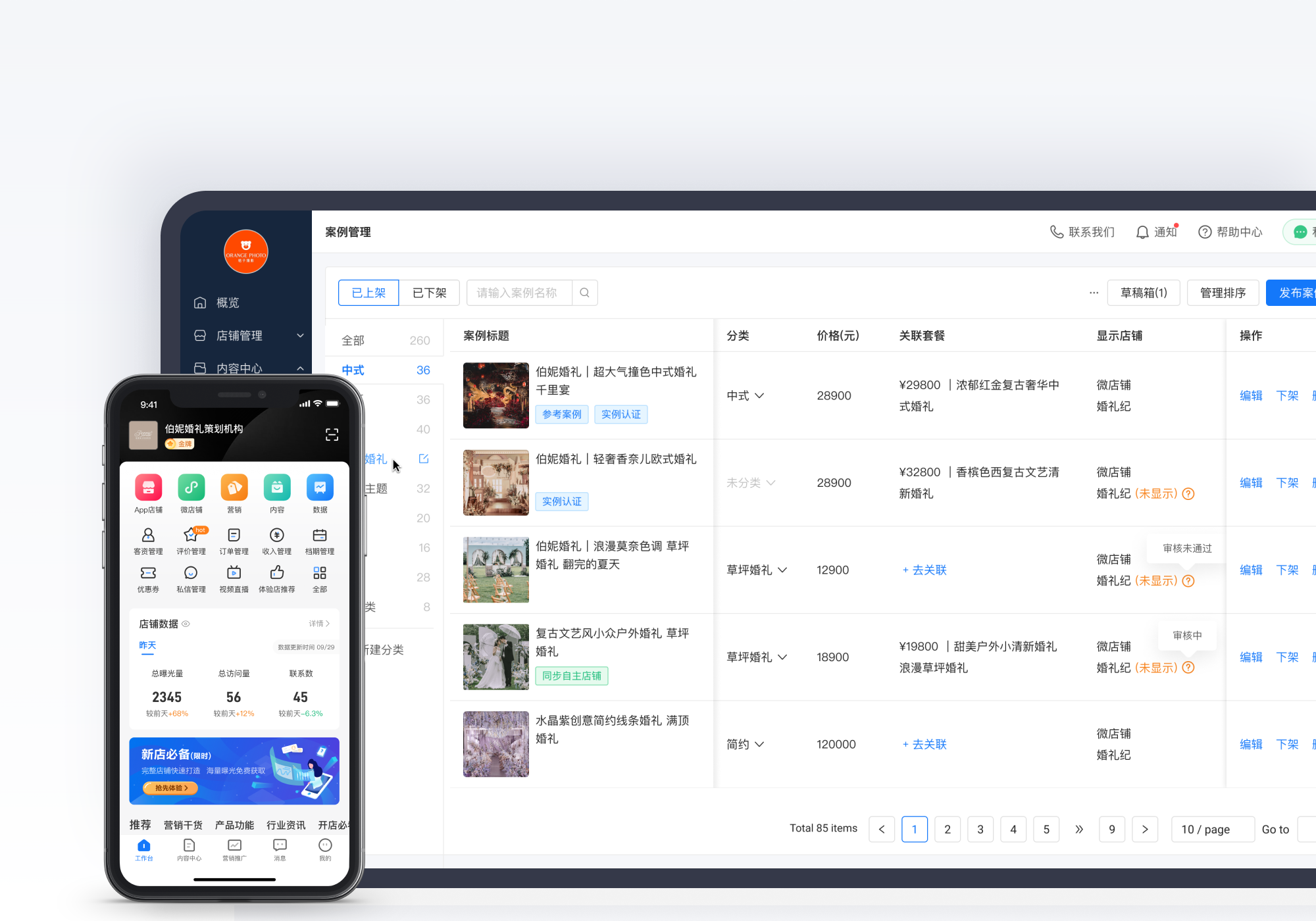
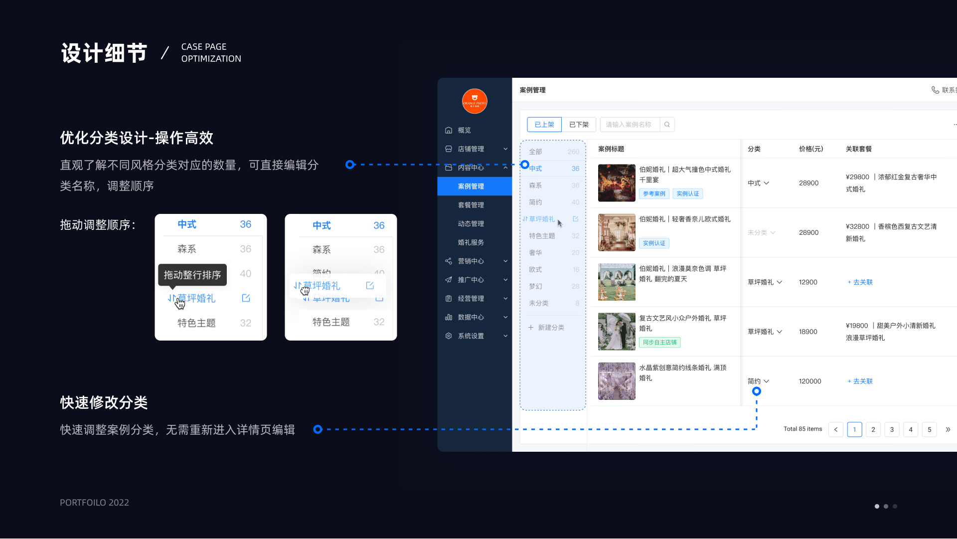
Case management
The previous management page made simple tasks feel overly procedural. Category editing happened in a separate page, filters were noisy, the top area was oversized, and the table itself made browsing hard when content became dense.
I shortened that path by moving category work closer to the list, reducing unnecessary jumps, and reorganizing the page so vendors could search, scan, sort, and adjust from one place.
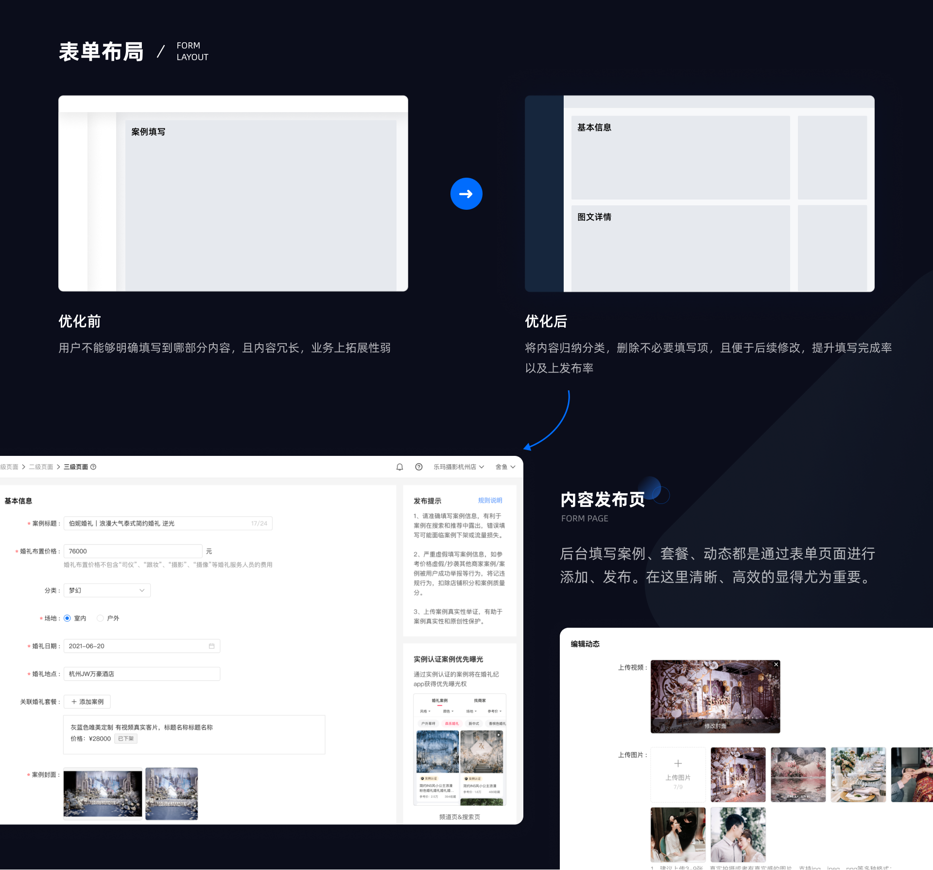
Publishing flow
Publishing was one of the heaviest tasks, so I broke it into clearer steps and grouped content by meaning rather than by raw business fields. The form was reorganized into sections like basic information and image detail, and unnecessary fields were removed where possible.
The goal was not to make the flow feel shorter than it was, but to make progress legible. Vendors needed to know what they had already completed, what still required input, and which fields actually affected publishing or exposure.
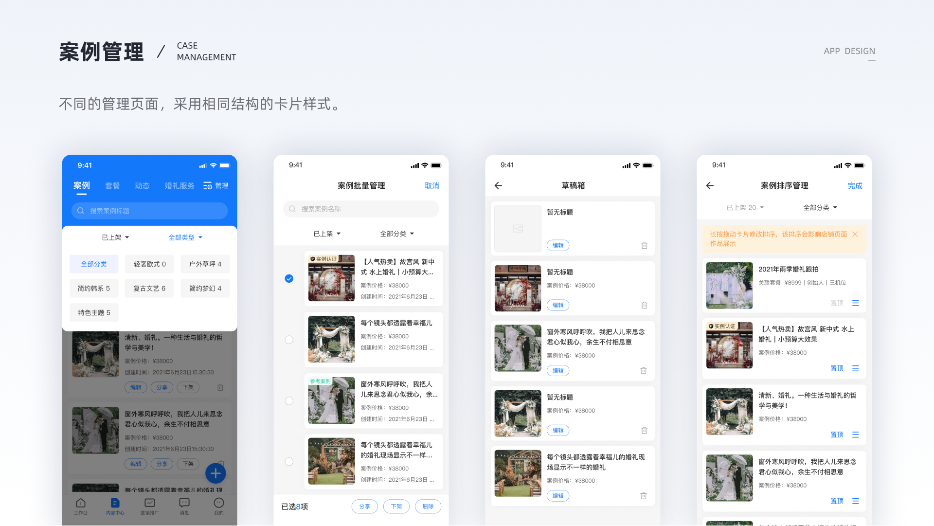
Mobile extension
The work also extended into the vendor app. Mobile case management carried the same intention: better content grouping, lighter management patterns, and stronger emphasis on frequent actions like publishing or checking operating data.
This mattered because the vendor portfolio workflow did not stop at the desktop backend. Vendors often uploaded updates, checked order-related information, or reviewed store data on mobile.
Impact
increase in case completion rate after launch, alongside a 12% decrease in page loss and faster publishing behavior.
One month after launch, case fill time dropped by 30 seconds, total release time dropped by 48 seconds, completion rate increased by 18.4%, and page loss decreased by 12%.
Reflection
This project pushed me beyond interface execution. It required business understanding, research synthesis, and coordination across product, operations, and engineering while still keeping the screen-level experience sharp.