Back to Work Catherine Wu
Case 06 · Selected Early Work

Selected Early Works

A compact set of earlier mobile, mini program, and campaign projects that shaped my visual range before the work moved more deeply into workflow systems and product logic.

Selected early work cover showing merchant app surfaces in a single presentation image.
A lighter archive of earlier work, grouped to show the visual and product foundation behind my current portfolio direction.

Context

I keep these projects grouped so the portfolio stays focused on my current direction, while still showing the foundation underneath it: interface craft, visual systems, implementation awareness, and campaign thinking.

Mobile product support

Merchant app work taught me how to condense dense business tasks into smaller, repeatable mobile interactions.

Visual system range

Mini program and channel work strengthened how I think about content rhythm, hierarchy, and stronger visual tone.

Campaign execution

Event and operational work made me faster at translating product goals into public-facing design that still feels coherent.

Merchant App

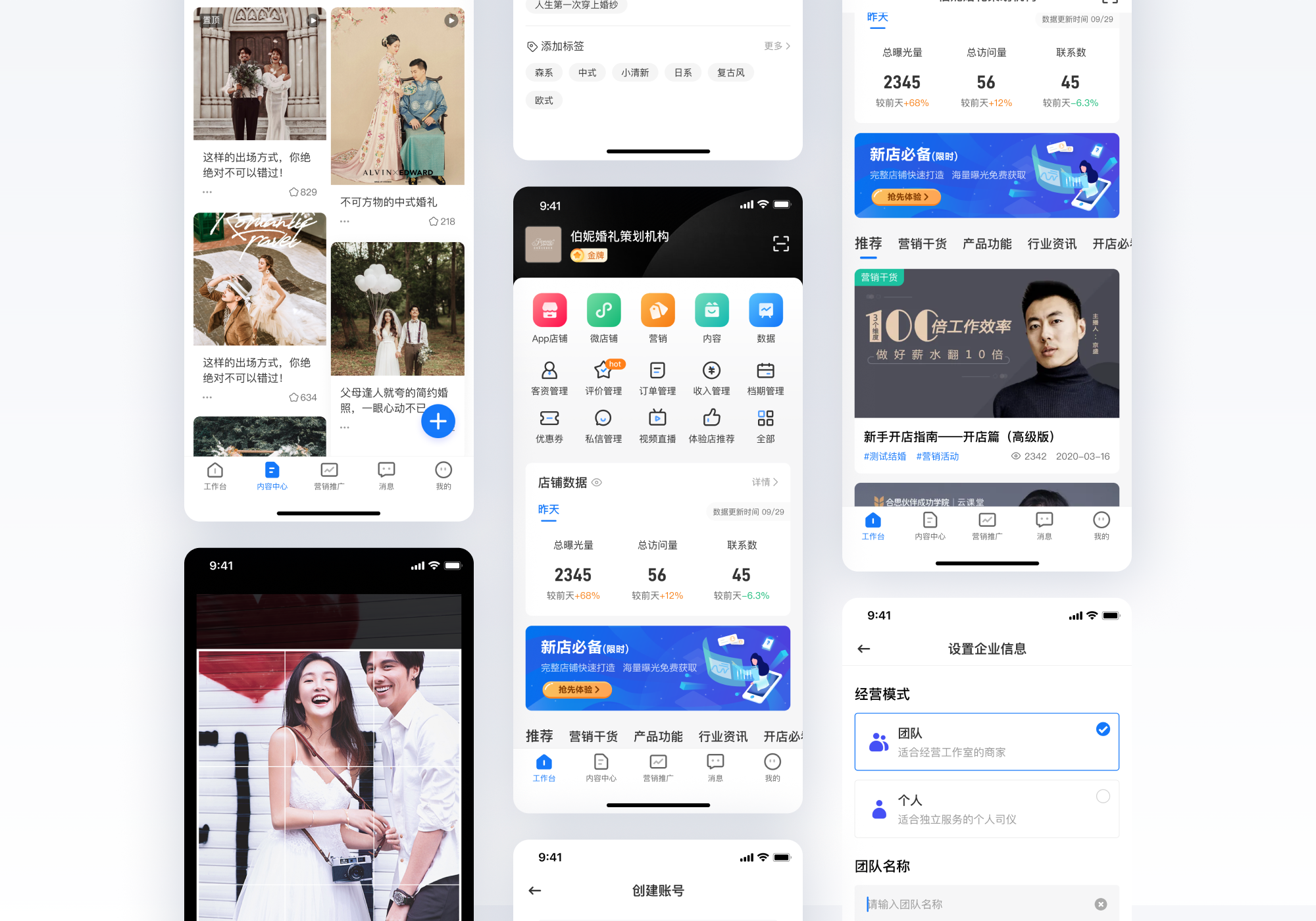
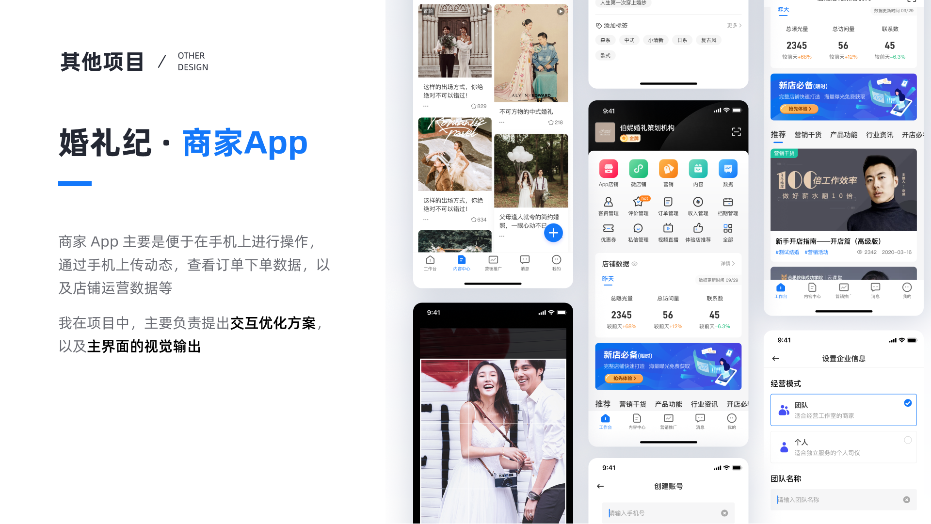
The merchant app focused on mobile operations: uploading updates, checking order data, and reviewing store performance. My role centered on interaction proposals and the main interface output.

Merchant app overview showing mobile store operations, data views, and business settings.
This work built fluency in turning dense business needs into clearer mobile cards, grouped actions, and more manageable status surfaces.

Mini Program + Campaign

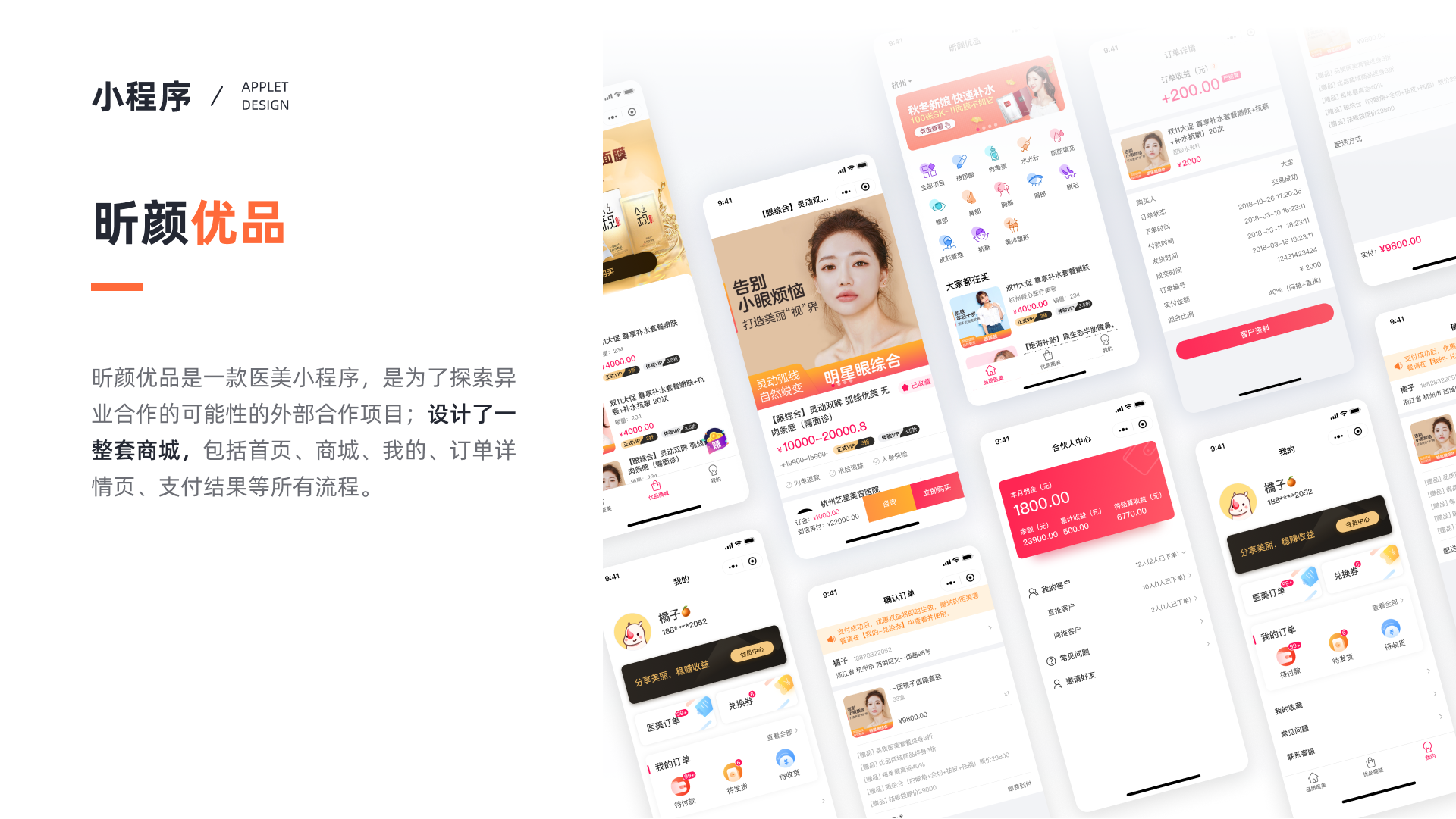
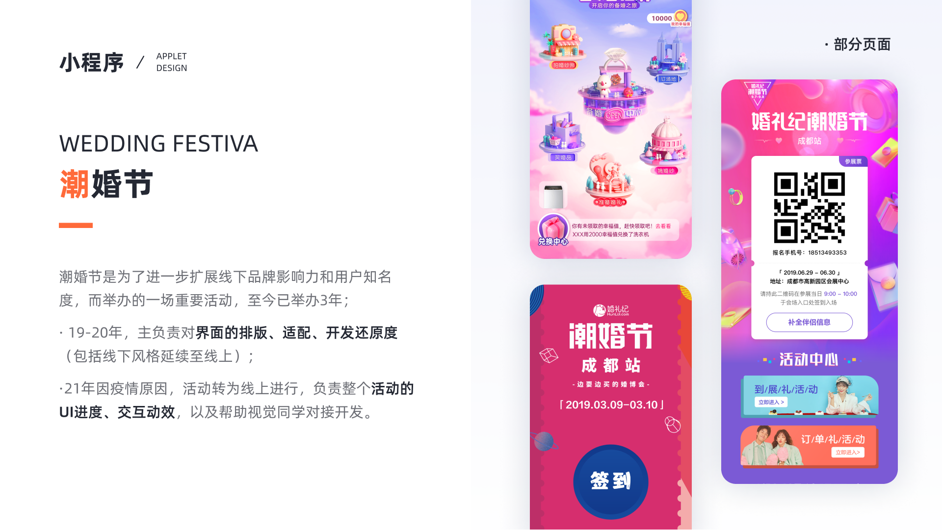
The mini program project explored a full external commerce flow, while the Wedding Festival work pushed further into event identity, adaptation, and production-level coordination between design and development.

Hearing Beauty mini program cover showing a complete shopping flow across multiple mobile screens.
Hearing Beauty was an external collaboration project that covered a full mini-program commerce flow, including homepage, store, order, and personal center.
Wedding Festival campaign visuals and activity pages for an online wedding event.
Wedding Festival extended offline brand energy into digital touchpoints, with attention to layout, adaptation, interaction effect, and implementation fidelity.

Supporting studies

Some earlier work is most useful as evidence of process and craft rather than as standalone portfolio cases. I still keep it because it shows how I tested visual rules, implementation details, and operational communication.

Color application study showing how image-based colors were extracted and normalized into interface use.
This study explored how image-derived colors could become interface overlays without collapsing into muddy or unreadable screens.
Mobile text QA study comparing design files and real mobile screenshots to improve typography fidelity.
Implementation QA around mobile text helped me build a stronger eye for layout fidelity and practical handoff constraints.
Operational activity posters and event pages created for Teamind workshops and reading sessions.
Operational activity work sharpened public-facing visual communication and showed how quickly a system can flex across different messages and formats.

Reflection

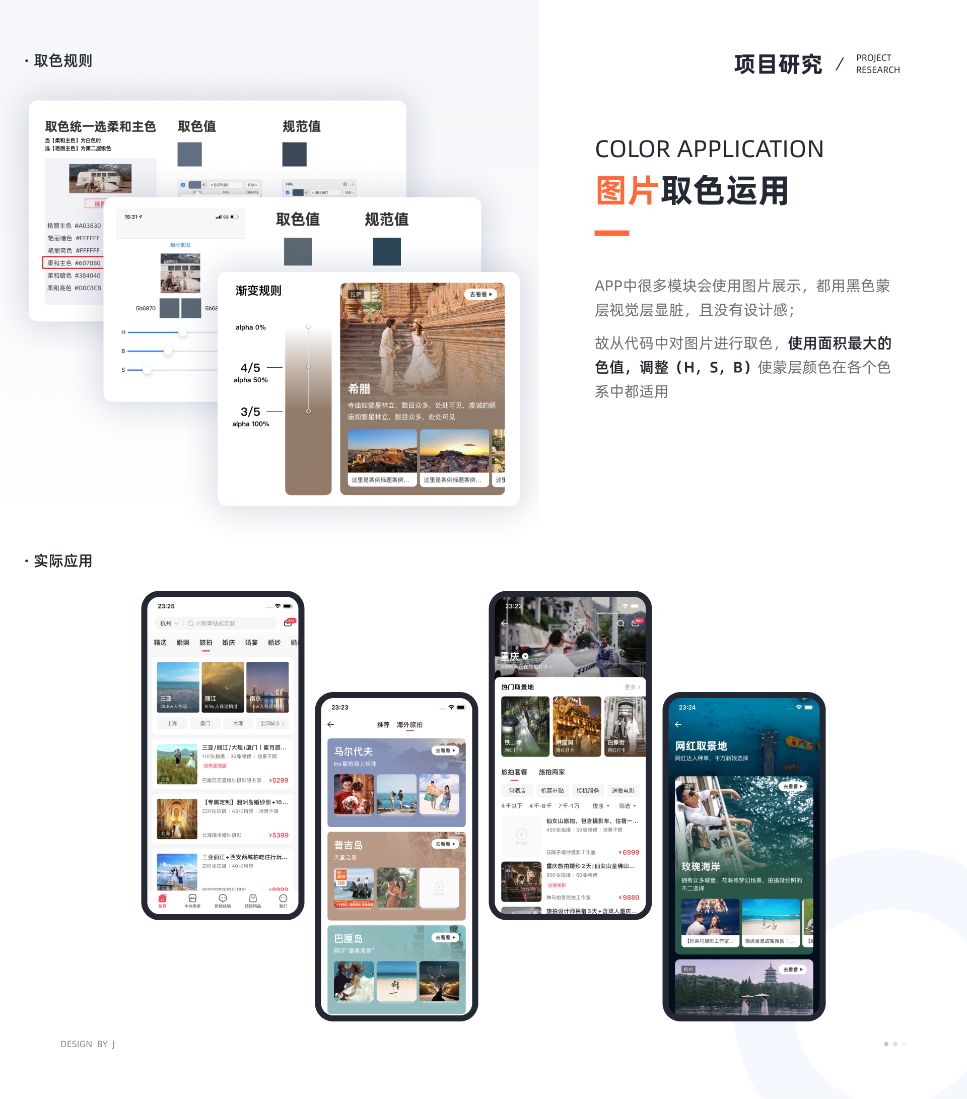
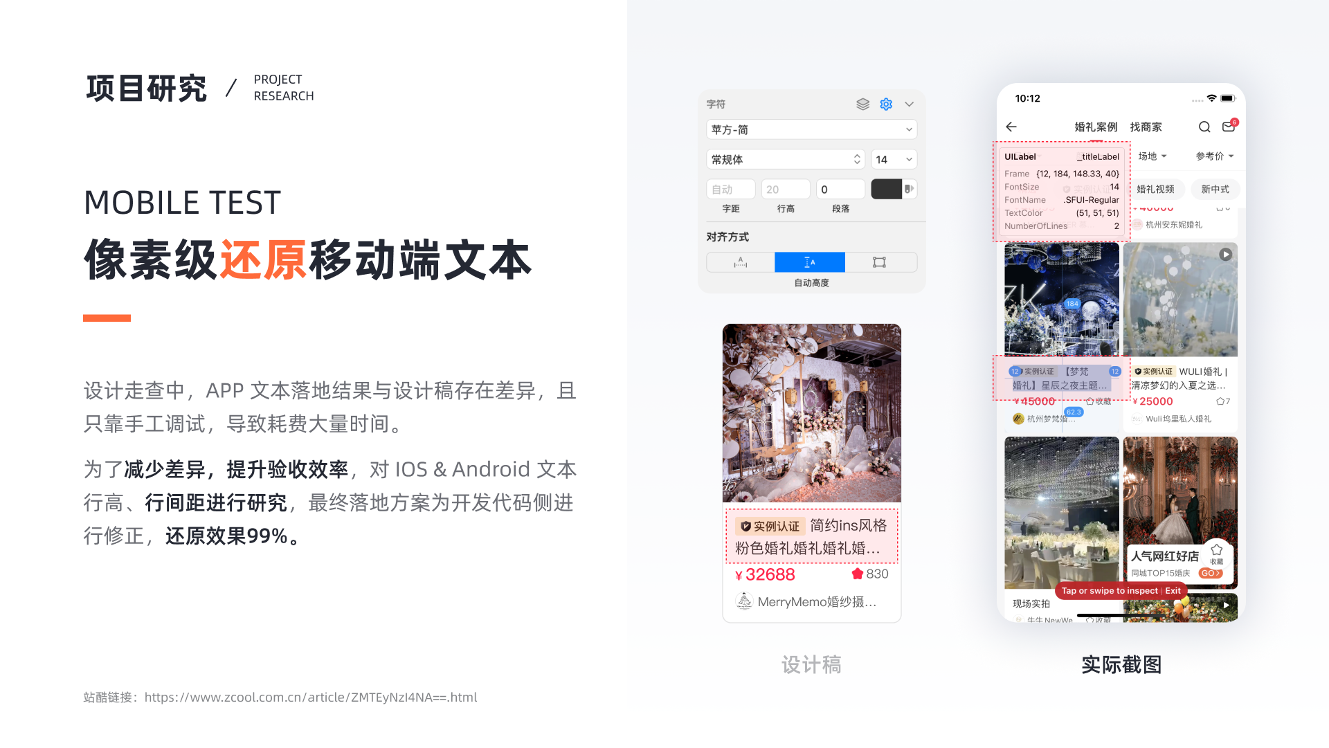
These earlier projects are more visual and more varied, but they explain an important part of my trajectory. Before I started emphasizing AI, workflow systems, and multi-role product logic, I learned how to make interfaces readable, how to push tone without losing clarity, and how to close the gap between design and shipped output.

The direction changed over time. The design habit underneath it stayed the same: make the work clearer, more usable, and more convincing.
Go back homepage